PROJECT DESCRIPTION
I was asked to design the EP album cover illustration for The Mess I've Made by Testimony A Cappella.
The Mess I've Made is an EP that includes five tracks that revolve around a Christian message of how our weakness and shame are redeemed by God's love and grace.
Once the EP album cover was finalized and approved, I worked with a software engineer to produce the EP splash page, which can be found here.
DESIGN DIRECTION
Role: Visual Design
Material: Adobe Illustrator, InDesign
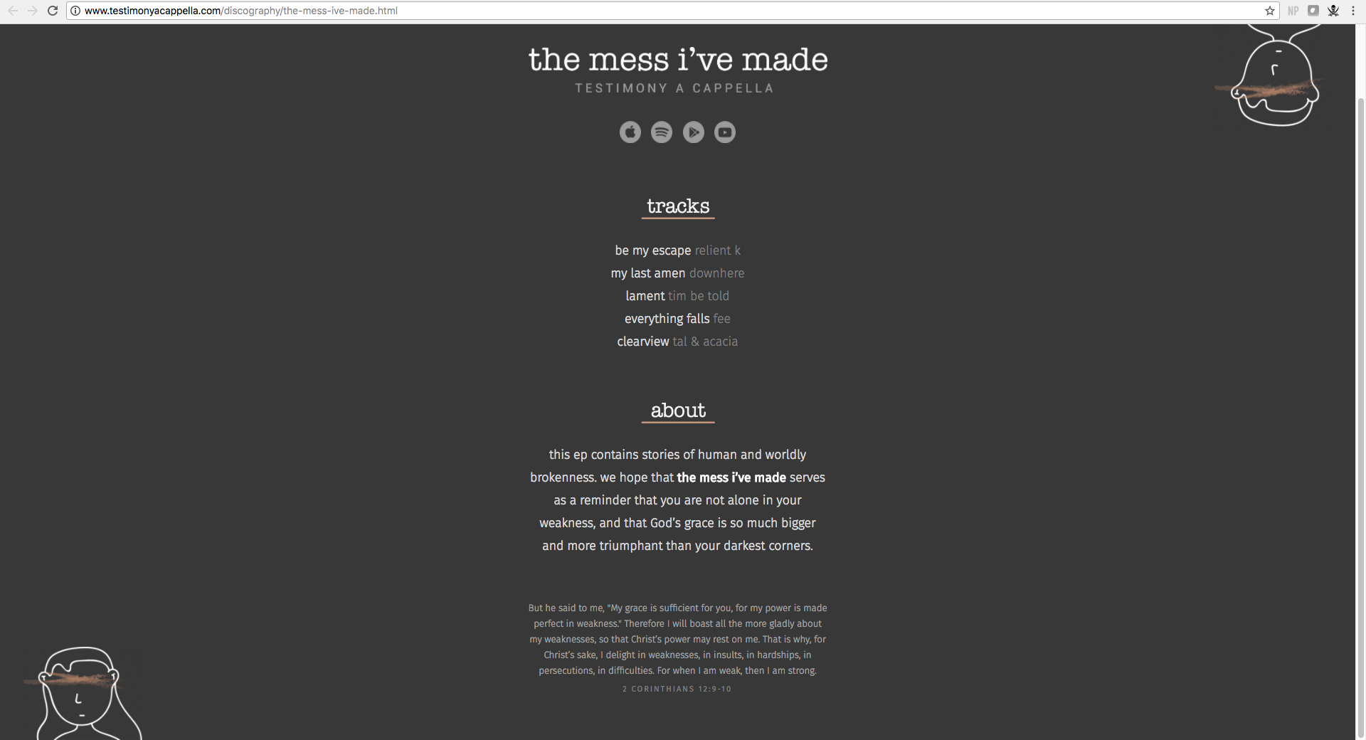
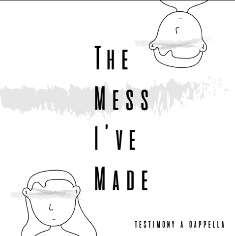
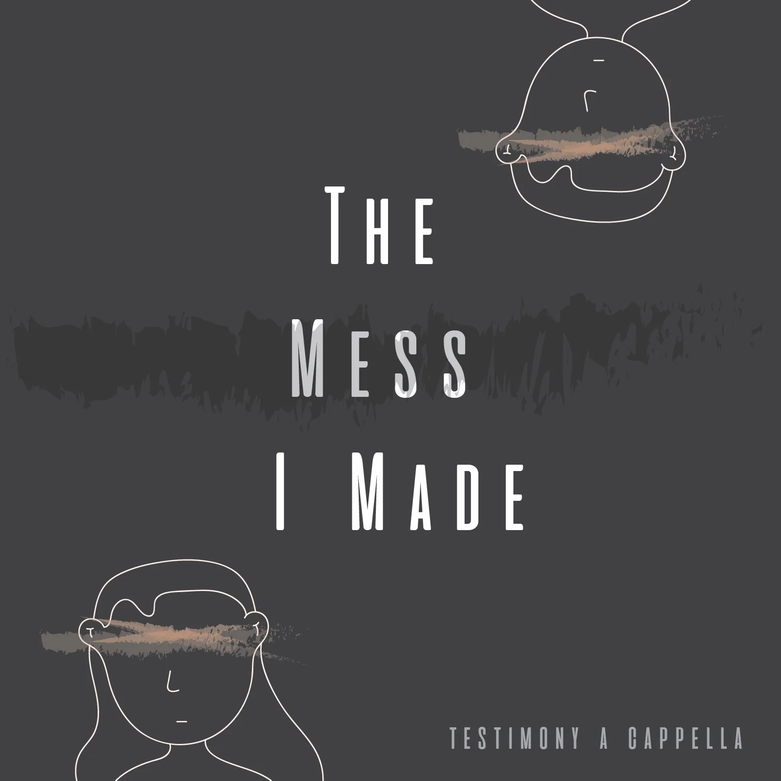
The visual design revolves around the story of the blind man in John 9 and the exposure of Adam and Eve in Genesis 3. In place of the humans' eyes, the dirt-colored strike marks indicate a sense of a two-pronged blindness: blindness to what is good in the moment (hence, the mess) and blindness to the hopeful perspective that God promises once the mess has been made. Without both faith in Christ and the touch of Christ, we are blinded by our shame; however, the dirt-colored strikes beckon for a healer to wipe away the mess we've made as we learn to put our trust in Him and subsequently revel in our weakness.

ITERATIONS
with final product shown first. The initial designs started out as nature-themed photographs with a minimal overlay of the album title. However, we wanted to take a more hand-drawn approach to indicate a sense of touch and a more direct connection with the image itself. Still vying for a minimal feel, I meditated on Jesus' encounter with the blind man in John 9 and made a few quick initial sketches on paper. I translated them digitally and sought to represent the man and woman as Adam and Eve, as a means of indicating the first recorded account of disobedience and subsequent shame in the Bible. The image went through multiple type, orientation, and color iterations; however, I settled with the first one displayed. The gray background not only gives a somber tone that relates to the idea of "mess," but also provokes a sort of mellow acceptance that while we continue to make these messes, we are humans in continuous refinement. There is hope. I also wanted the strikes to stand out as a means of emphasizing the notion around shame, blindness, and faith.

WEB PAGE
Based on the album cover illustration, the following images are screenshots of the official EP splash page that I designed in InDesign. We wanted the CTAs to be immediately clickable, as they lead to direct access to the EP tracks. Rather than showing the EP description first, we give the user the choice to click on the down-faced arrow to 1) keep a simple and clean layout and 2) give them a sense of "revealing" and "understanding" through choosing to proceed, which relates to the freedom of faith.